Bivariate Hypothesis Testing
We will learn four new things:
- Fitting a simple linear regression model
- How to produce a publication-quality regression table.
- How to produce a graph to illustrate the effect of x on y
- How to obtain predicted values using the predict command
First, let’s get packages loaded.
# If you are using your own computer, it's better if you do the installation

# install.packages("stargazer", dependencies = TRUE)
# install.packages("effects", dependencies = TRUE)

rm(list = ls())       # delete everything in the memory
library(ggplot2)      # for graphics
library(Hmisc)        # for rcorr
library(stargazer)    # Regression table
library(effects)      # for effect
Read-in the Putnam 1994 data
load("putnam.rda")
pd <- putnam; rm(putnam)
# Take a look
dim(pd)
## [1] 20 5
# Take a look at Region names, Y, and X:
pd[c("Region","InstPerform","CivicCommunity")]
##    Region InstPerform CivicCommunity
## 1      Ab         7.5            8.0
## 2      Ba         7.5            4.0
## 3      Cl         1.5            1.0
## 4      Cm         2.5            2.0
## 5      Em        16.0           18.0
## 6      Fr        12.0           17.0
## 7      La        10.0           13.0
## 8      Li        11.0           16.0
## 9      Lo        11.0           17.0
## 10     Ma         9.0           15.5
## 11     Mo         6.5            3.5
## 12     Pi        13.0           15.5
## 13     Pu         5.5            3.5
## 14     Sa         5.5            8.5
## 15     Si         4.5            3.5
## 16     To        13.0           17.5
## 17     Tr        11.0           18.0
## 18     Um        15.0           15.5
## 19     Va        10.0           15.0
## 20     Ve        11.0           15.0
Review 1: Numerical and visual summaries
Y: Institutional Performance
Note that “Institutional Performance” is called “InstPerform” in the data set
summary(pd $ InstPerform)
##    Min. 1st Qu.  Median    Mean 3rd Qu.    Max.
##    1.50    6.25   10.00    9.15   11.25   16.00
X: civic community index
Note that “Civic Community Index” is called “CivicCommunity” in the data set
summary(pd $ CivicCommunity)
##    Min. 1st Qu.  Median    Mean 3rd Qu.    Max.
##   1.000   3.875  15.000  11.350  16.250  18.000
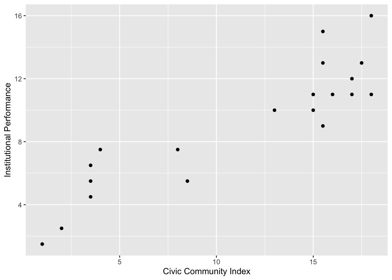
Scatter plot
g <- ggplot(pd, aes(x = CivicCommunity, y = InstPerform)) + geom_point()
g <- g + ylab("Institutional Performance") + xlab("Civic Community Index")
g
# ggsave(file="ipcci1.pdf", width=8, height=6)
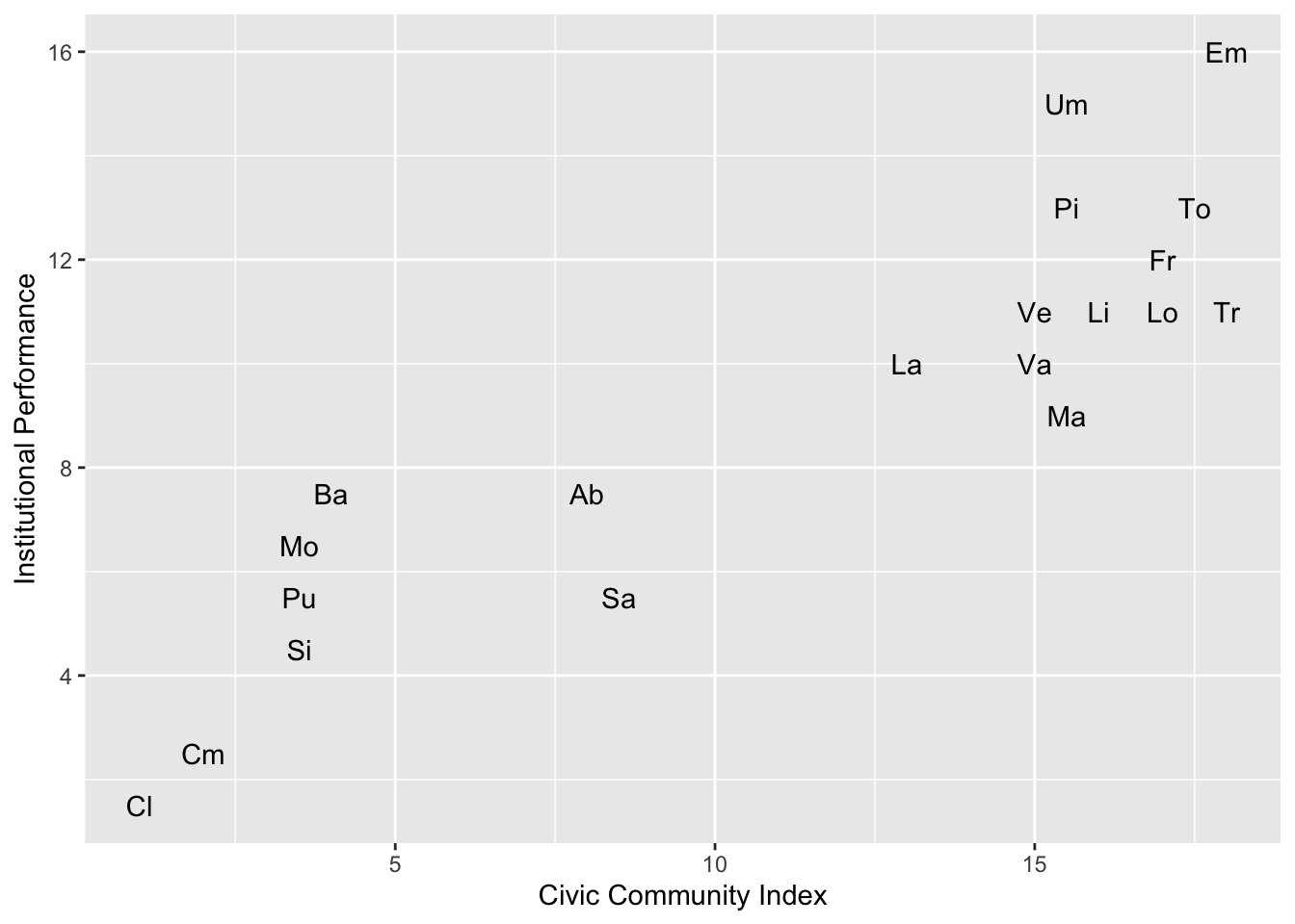
# Plot region names instead of points

g <- ggplot(pd, aes(x = CivicCommunity, y = InstPerform))
g <- g + geom_text(aes(label = Region))
g <- g + ylab("Institutional Performance") + xlab("Civic Community Index")
g
# ggsave(file="ipcci2.pdf", width=8, height=6)
Review 2: Correlation analysis
Since both DV and IV are numerical, we could do correlation analysis. Recall that, to calculate r (correlation coefficient), we use the rcorr function from the Hmisc package
rcorr(pd $ InstPerform, pd $ CivicCommunity)
##     x   y
## x 1.0 0.9
## y 0.9 1.0
##
## n= 20
##
##
## P
##   x  y
## x     0
## y  0
We can see that the correlation coefficient is 0.9 (first part of the output) and the associated p-value is shown as 0 (bottom part of the output). P-values cannot be exactly equal to 0, but R just reports rounded values. We say that p-value here is < 0.001.
As I pointed out in the lecture, correlation coefficients cannot tell us the strength of the relationship. Smaller p-values do NOT imply stronger relationships between X and Y. They merely mean that we can have a greater confidence that there is a positive/negative relationship.
1. Simple linear regression
To run a linear regression, we use the lm function (lm stands for Linear Model) lm(formula, data) formula takes the following form: Y ~ X1 + X2 + X3 + … + Xk where Y is the name of the DV, X1,…Xk are the IVs. When you have only one independent variable, the formula is just: Y ~ X1
To run a regression where “Institutional Performance” is the DV and “Civic Community” is the IV, we write
lm(InstPerform ~ CivicCommunity, data = pd)
##
## Call:
## lm(formula = InstPerform ~ CivicCommunity, data = pd)
##
## Coefficients:
##    (Intercept)  CivicCommunity
##         2.7112          0.5673
# Alternatively, this will also work
lm(pd $ InstPerform ~ pd $ CivicCommunity)
##
## Call:
## lm(formula = pd$InstPerform ~ pd$CivicCommunity)
##
## Coefficients:
##       (Intercept)  pd$CivicCommunity
##            2.7112             0.5673
# But this won't work. Do you see why?
# lm(InstPerform ~ CivicCommunity)
As usual, we store things in an object, so that we can do some additional analyses. Let’s store the regression output in an object named fit.1
fit.1 <- lm(InstPerform ~ CivicCommunity, data = pd)
# library(magrittr)
# lm(InstPerform ~ CivicCommunity, data = pd) %>% summary
# Now that we stored the regression output in an object, we can
# apply functions such as summary or stargazer

summary(fit.1)
##
## Call:
## lm(formula = InstPerform ~ CivicCommunity, data = pd)
##
## Residuals:
##     Min      1Q  Median      3Q     Max
## -2.5043 -1.3481 -0.2087  0.9764  3.4957
##
## Coefficients:
##                Estimate Std. Error t value Pr(>|t|)
## (Intercept)     2.71115    0.84443   3.211  0.00485 **
## CivicCommunity  0.56730    0.06552   8.658 7.81e-08 ***
## ---
## Signif. codes:  0 '***' 0.001 '**' 0.01 '*' 0.05 '.' 0.1 ' ' 1
##
## Residual standard error: 1.789 on 18 degrees of freedom
## Multiple R-squared:  0.8064,	Adjusted R-squared:  0.7956
## F-statistic: 74.97 on 1 and 18 DF,  p-value: 7.806e-08
A lot of info is provided here, but we may not need all of it. Let’s just have a simplified table. To have a publication-quality table output, we use the stargazer function from the stargazer package:
stargazer(fit.1, type = "text")
##
## ===============================================
##                         Dependent variable:
##                     ---------------------------
##                             InstPerform
## -----------------------------------------------
## CivicCommunity               0.567***
##                               (0.066)
##
## Constant                     2.711***
##                               (0.844)
##
## -----------------------------------------------
## Observations                    20
## R2                             0.806
## Adjusted R2                    0.796
## Residual Std. Error       1.789 (df = 18)
## F Statistic           74.967*** (df = 1; 18)
## ===============================================
## Note:               *p<0.1; **p<0.05; ***p<0.01
# stargazer(fit.1, type = "latex")
From the table, we can see that the effect of Civic Community Index on Institutional Performance is 0.567 and it is highly statistically significant. That is, a one unit increase in Civic Community Index increases Institutional Performance by 0.567.
The estimated regression line is
InstPerform-hat = 2.711 + 0.567 * CivicCommunity
We can also see that:
* There are 20 observations in the sample
* R squared is 0.806
* Residual Standard Error (RMSE) is 1.789
You can ignore the rest, at least for now.
2. Regression table
The stargazer function allows you to produce a regression table quite easily.
stargazer(fit.1, type = "text")
##
## ===============================================
##                         Dependent variable:
##                     ---------------------------
##                             InstPerform
## -----------------------------------------------
## CivicCommunity               0.567***
##                               (0.066)
##
## Constant                     2.711***
##                               (0.844)
##
## -----------------------------------------------
## Observations                    20
## R2                             0.806
## Adjusted R2                    0.796
## Residual Std. Error       1.789 (df = 18)
## F Statistic           74.967*** (df = 1; 18)
## ===============================================
## Note:               *p<0.1; **p<0.05; ***p<0.01
By changing the type = argument, we can produce tables in other formats, which would make it quite easy to produce a high-quality regression table for our write-up.
As I understand it, most of you are MS Word user. If so, the easiest way to insert a regression table into a Word file is to do the following:
- Use the stargazer function to create an html file.
- Open the html file with an internet browser (Chrome, Safari, Internext Explorer, etc.)
- Select all (CTRL + A), and copy and paste into a Word file.
- But I would strongly recommend you stopping Word anymore. It’s expensive and not a best fit to academic publishing. Use Latex!
If you are a LaTeX user like me, you can do the following:
# stargazer(fit.1, type = "latex", out = "regtbl.tex")
3. Interpreting the outputs graphically
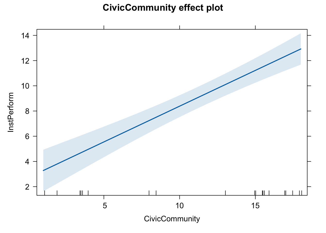
To produce a graph that illustrates the estimated effect of X on Y, we use the effect function from the effects package.
library(effects)

effect(term = "CivicCommunity", mod = fit.1)
##
##  CivicCommunity effect
## CivicCommunity
##         1       5.2       9.5        14        18
##  3.278452  5.661109  8.100496 10.653343 12.922540
# As we saw in the lecture, the output shows that
# When X is 1, the predicted value of Y is 3.278452;
# When X is 5.2, the predicted value of Y is 5.661109;
# When X is 9.5, the predicted value of Y is 8.100496;
# When X is 14, the predicted value of Y is 10.653343;
# When X is 18, the predicted value of Y is 12.922540.
#
# This is still not very intuitive / informative.
# So we plot the estimated regression line.
We first store the output into an object called eff.CC, and apply the plot function, as follows:
eff.CC <- effect("CivicCommunity", mod = fit.1)
plot(eff.CC)
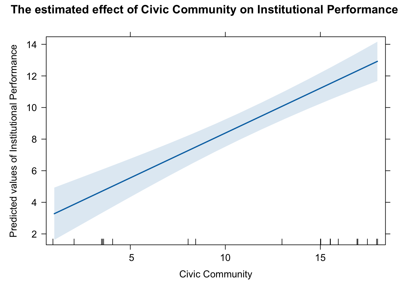
plot(eff.CC,
     main = "The estimated effect of Civic Community on Institutional Performance",
     xlab = "Civic Community",
     ylab = "Predicted values of Institutional Performance")
# pdf(file = "effect_plot_ip.pdf", width = 8, height = 6)
# plot(eff.CC,
#      main = "The estimated effect of Civic Community on Institutional Performance",
#      xlab = "Civic Community",
#      ylab = "Predicted values of Institutional Performance")
# dev.off()
Or alternatively, if you think it is ugly by using the effect function, you can use ggplot. You should use ggplot all the time IMHO.
library(ggeffects)
# marginal effects for the variable of interest.
pr <- ggpredict(fit.1, c("CivicCommunity"))

# use plot() method, easier than own ggplot-code from scratch
plot(pr) + theme(legend.position = "bottom") + xlab("Civic Community") + ylab("Institutional Performance") + ggtitle("The estimated effect of Civic Community on Institutional Performance")
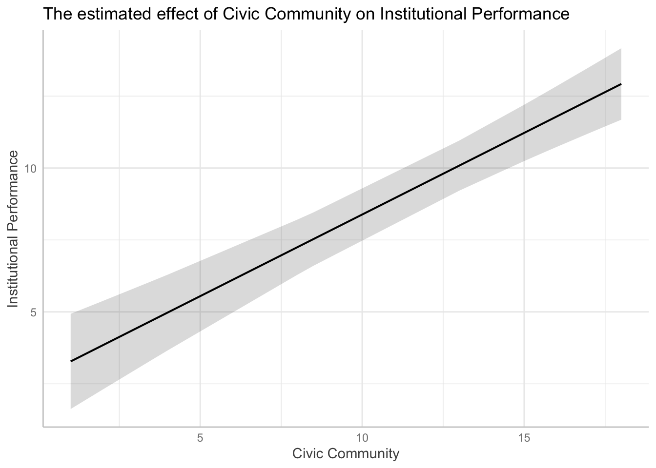
We can now easily see that, as X increases, Y is expected to increase.
4. Obtaining predicted values
As the regression line is also a prediction line, we can obtain predicted values of y (y-hat) for a given value of x. Recall that the regression line we obtained was: y-hat = 2.7112 + 0.5673 * x
fit.1
##
## Call:
## lm(formula = InstPerform ~ CivicCommunity, data = pd)
##
## Coefficients:
##    (Intercept)  CivicCommunity
##         2.7112          0.5673
# So, what's the predicted value when x = 0? When x = 1?
# We can answer this by plugging in these values into the equation.

# When x = 0,
# y-hat = 2.7112 + 0.5673 * x  will just be
# y-hat = 2.7112 + 0.5673 * 0
# so it is equal to 2.7112.

# When x = 1,
# y-hat = 2.7112 + 0.5673 * x will be
# y-hat = 2.7112 + 0.5673 * 1
# so it is equal to 2.7112 + 0.5673 = 3.2785.
In a similar way, we can obtain the predicted values of y for the actual values of x (Civic Community).
pd
##    Region InstPerform CivicCommunity NorthSouth EconModern
## 1      Ab         7.5            8.0      South        7.0
## 2      Ba         7.5            4.0      South        3.0
## 3      Cl         1.5            1.0      South        3.0
## 4      Cm         2.5            2.0      South        6.5
## 5      Em        16.0           18.0      North       13.0
## 6      Fr        12.0           17.0      North       14.5
## 7      La        10.0           13.0      North       12.5
## 8      Li        11.0           16.0      North       15.5
## 9      Lo        11.0           17.0      North       19.0
## 10     Ma         9.0           15.5      North       10.5
## 11     Mo         6.5            3.5      South        2.5
## 12     Pi        13.0           15.5      North       17.0
## 13     Pu         5.5            3.5      South        4.0
## 14     Sa         5.5            8.5      South        8.5
## 15     Si         4.5            3.5      South        5.5
## 16     To        13.0           17.5      North       14.5
## 17     Tr        11.0           18.0      North       12.5
## 18     Um        15.0           15.5      North       11.0
## 19     Va        10.0           15.0      North       15.0
## 20     Ve        11.0           15.0      North       13.5
As we see, the actual values of Civic Community are 8.0, 4.0, 1.0, 2.0,…, etc. Of course, doing such calculation “by hand” is too tedious. We will use the predict command to simplify the task. The predict command takes a regression output as an argument, as follows:
predict(fit.1)
##         1         2         3         4         5         6         7         8
##  7.249547  4.980350  3.278452  3.845751 12.922540 12.355241 10.086044 11.787942
##         9        10        11        12        13        14        15        16
## 12.355241 11.504292  4.696700 11.504292  4.696700  7.533197  4.696700 12.638891
##        17        18        19        20
## 12.922540 11.504292 11.220642 11.220642
We obtained 20 values, because there are 20 observations in the data set. The first value, 7.249547, is the predicted value of y when x is equal to the first value of Civic Community in the data (8.0). You can convince yourself by doing this by hand, as follows
2.7112 + 0.5673 * 8.0
To make it easier to view the data, let’s save these predicted values into the data frame object as a new column called y.hat
pd $ y.hat <- predict(fit.1)
summary(fit.1)
##
## Call:
## lm(formula = InstPerform ~ CivicCommunity, data = pd)
##
## Residuals:
##     Min      1Q  Median      3Q     Max
## -2.5043 -1.3481 -0.2087  0.9764  3.4957
##
## Coefficients:
##                Estimate Std. Error t value Pr(>|t|)
## (Intercept)     2.71115    0.84443   3.211  0.00485 **
## CivicCommunity  0.56730    0.06552   8.658 7.81e-08 ***
## ---
## Signif. codes:  0 '***' 0.001 '**' 0.01 '*' 0.05 '.' 0.1 ' ' 1
##
## Residual standard error: 1.789 on 18 degrees of freedom
## Multiple R-squared:  0.8064,	Adjusted R-squared:  0.7956
## F-statistic: 74.97 on 1 and 18 DF,  p-value: 7.806e-08
pd
##    Region InstPerform CivicCommunity NorthSouth EconModern     y.hat
## 1      Ab         7.5            8.0      South        7.0  7.249547
## 2      Ba         7.5            4.0      South        3.0  4.980350
## 3      Cl         1.5            1.0      South        3.0  3.278452
## 4      Cm         2.5            2.0      South        6.5  3.845751
## 5      Em        16.0           18.0      North       13.0 12.922540
## 6      Fr        12.0           17.0      North       14.5 12.355241
## 7      La        10.0           13.0      North       12.5 10.086044
## 8      Li        11.0           16.0      North       15.5 11.787942
## 9      Lo        11.0           17.0      North       19.0 12.355241
## 10     Ma         9.0           15.5      North       10.5 11.504292
## 11     Mo         6.5            3.5      South        2.5  4.696700
## 12     Pi        13.0           15.5      North       17.0 11.504292
## 13     Pu         5.5            3.5      South        4.0  4.696700
## 14     Sa         5.5            8.5      South        8.5  7.533197
## 15     Si         4.5            3.5      South        5.5  4.696700
## 16     To        13.0           17.5      North       14.5 12.638891
## 17     Tr        11.0           18.0      North       12.5 12.922540
## 18     Um        15.0           15.5      North       11.0 11.504292
## 19     Va        10.0           15.0      North       15.0 11.220642
## 20     Ve        11.0           15.0      North       13.5 11.220642
Now, the data set contains an additional column, y.hat. These are the predicted values of y for each value of Civic Community.
A nice thing about the predict command is that it can take a data set that is NOT the one we used to estimate the model. That is, we can obtain predicted values of y for some hypothetical values of x. This exercise is called out-of-sample prediction, as we predict values of y for the values of x that are out of the current sample.
To do so, we first create a new data frame that has the same independent variable used in the regression. In our case, CivicCommunity. Let’s insert the following values: 0, 5, 10, 20
new.data <- data.frame(CivicCommunity = c(0,5,10,20) )
new.data
##   CivicCommunity
## 1              0
## 2              5
## 3             10
## 4             20
# Now, we will feed this data into the predict command, as follows:

predict( fit.1, newdata = new.data )
##         1         2         3         4
##  2.711153  5.547649  8.384146 14.057139
new.data $ y.hat <- predict( fit.1, newdata = new.data )
new.data
##   CivicCommunity     y.hat
## 1              0  2.711153
## 2              5  5.547649
## 3             10  8.384146
## 4             20 14.057139
This is how the substantive effect plot can be manually created.
library(ggeffects)
# marginal effects for the variable of interest.
pr <- ggpredict(fit.1, c("CivicCommunity"))

# use plot() method, easier than own ggplot-code from scratch
plot(pr) + theme(legend.position = "bottom") + xlab("Civic Community") + ylab("Institutional Performance") + ggtitle("The estimated effect of Civic Community on Institutional Performance")
