Bivariate Hypothesis Testing
We will learn three main things during this week’s lab session:
- Cross tabulation
- Correlation analysis
- Adding lines and labels to a graph
First, let’s get packages loaded.
rm(list = ls())       # This code deletes all the objects currently stored in the memory.
                      # It is advisable to execute this at the outset, so that other
                      # people can replicate what you did by running your code (and not
                      # by doing something you have done without leaving the trace of it.)

library(gmodels)      # for CrossTable()
library(Hmisc)        # for rcorr()
library(ggplot2)      # for graphics
library(rworldmap)    # for drawing maps
library(countrycode)  # for managing country codes

# read-in the world data
world.data <- read.csv("world.csv")
1. Cross tabulation
Bivariate test for categorical X and categorical Y
We examine the relationship between Ethnic Fractionalization (X) and PR system (Y).
As we have learned in the lecture, we proceed in four steps:
- Form the null and alternative hypotheses
- Examine the X-Y relationship in the sample
2.1: Examine Y
2.2: Examine X
2.3: Examine the X-Y relationship - Calculate the test-statistic and p-value.
- We reject the null if the p-value is lower than some threshold.
Step 1. Null and alternative hypotheses
The null hypothesis (sometimes denoted as H0) is obviously that there is no relationship between X and Y. That is, PR system is not more or less likely for different levels of ethnic fractionalization. An alternative hypothesis would be that, when ethnic fractionalization is greater, PR system is less likely.
Step 2. Examine the data
2.1 Describe Y: PR system
table(world.data $ pr_sys)
##
##  No Yes
## 124  67
# Let's recode the labels to make them more intuitive.

world.data $ pr <- factor(world.data $ pr_sys,
                        levels = c("Yes", "No"),
                        labels = c("PR System", "Non-PR"))

table(world.data $ pr)
##
## PR System    Non-PR
##        67       124
2.2. Describe X: Ethnic fractionalization
The data set contains frac_eth3 variable that measures the levels of ethnic fractionalization in a country by classifying into three ordered categories, Low, Medium, and High. Let’s take a look at this variable.
table(world.data $ frac_eth3)
##
##          High    Low Medium
##      3     62     62     64
# summary(world.data $ frac_eth3) # This will give us the same results.
Notice two things:
First, there is a strange blank in the first line of the output, followed by “High Low Medium”. To see this more clearly, let’s take a look at all the values paired with country names:
tail(world.data[c("country", "frac_eth3")])
##                 country frac_eth3
## 186             Vietnam       Low
## 187       Western Samoa       Low
## 188               Yemen
## 189 Serbia & Montenegro    Medium
## 190              Zambia      High
## 191            Zimbabwe    Medium
Notice that the values are missing (blank) for a few countries, such as Yemen, Sao Tome, and Macedonia. So, the blank in this case represents missing values. Remember that sometimes missing values are given unusual values, such as -99, -88, or ““? This is one of such cases. For some reason, the data coder put a blank instead of a proper value (NA) for missing cases. Let’s keep this in mind (we’ll do something about this later).
Second, I’d like you to notice is the ordering of values.
table(world.data $ frac_eth3)
##
##          High    Low Medium
##      3     62     62     64
Notice that the values are NOT ordered in an intuitive way. That is, in the R output, “High” comes first, followed by “Low”, then “Medium”. They are simply ordered alphabetically (H, L, M), not from High to Low or from Low to High. We thus need to make R recognize that this is an ORDERED categorical variable, not a nominal variable.
We do this using the factor function we used to re-label a factor variable. The factor function has an option (argument) called “ordered”. If we set this as ordered = TRUE, R will recognize that there is an ordering between values. The order must be specified in the level argument.
Let’s do this by creating a new variable named frac_eth3_ord.
world.data $ frac_eth3_ord <- factor(world.data $ frac_eth3,
                                     level = c("Low", "Medium", "High"), # order it in this way
                                     ordered = TRUE)

# Let's describe this newly created variable.

table(world.data $ frac_eth3_ord)
##
##    Low Medium   High
##     62     64     62
Now, the strange blank category is gone (because we didn’t include it in specifying the level) and the values are ordered from Low to High. Whenever you re-code or re-label a variable, we should check if it worked correctly. One way to do this is to compare the old and the new variables.
table(world.data $ frac_eth3)
##
##          High    Low Medium
##      3     62     62     64
table(world.data $ frac_eth3_ord)
##
##    Low Medium   High
##     62     64     62
But, since two categories (High and Low) have the same number of cases (62) we cannot be 100% sure that we did NOT mistake Low for High. To do this comparison more thoroughly, we create a two-by-two table, as follows
table( world.data $ frac_eth3, world.data $ frac_eth3_ord )
##
##          Low Medium High
##            0      0    0
##   High     0      0   62
##   Low     62      0    0
##   Medium   0     64    0
Now we can see that “High” in the original indeed corresponds to “High” in the new variable, “Low” in the original to “Low” in the new variable, etc.
2.3 Describe X-Y
There are several ways to do cross tabulation (two-way frequency table). The simplest way is to use the table function, just as we did above.In doing so, make sure that you put your dependent variable first, as follows: table( Y, X )
table( world.data $ pr, world.data $ frac_eth3_ord )
##
##             Low Medium High
##   PR System  23     27   15
##   Non-PR     39     37   47
This ensures that the values of Y are shown in rows and values of X are shown in columns. If you do the opposite (i.e., table(X, Y)), readers cannot readily understand which variable is being treated as Y and which one is being treated as X.
Step 3 and 4. Calculate test-statistic & p (useful with binary values on both x and y)
The simple two-way frequency table we created above is perhaps too simple. Each cell entry only shows the raw frequency = the number of observations that fall into each combination of X-Y values. (For example, there are 23 countries that are coded as having “Low” level of ethnic fractionalization AND have a PR system, etc.)
What we want in addition to these is the following:
- column percentages (so that we can identify some patterns, if any)
- test statistic (in this case, chi-squared statistic)
- p-value for the test statistic
The CrossTable function included in the gmodels package does all the three at once. Again, we put Y first, X next.
CrossTable( world.data $ pr, world.data $ frac_eth3_ord )
##
##
##    Cell Contents
## |-------------------------|
## |                       N |
## | Chi-square contribution |
## |           N / Row Total |
## |           N / Col Total |
## |         N / Table Total |
## |-------------------------|
##
##
## Total Observations in Table:  188
##
##
##               | world.data$frac_eth3_ord
## world.data$pr |       Low |    Medium |      High | Row Total |
## --------------|-----------|-----------|-----------|-----------|
##     PR System |        23 |        27 |        15 |        65 |
##               |     0.114 |     1.073 |     1.932 |           |
##               |     0.354 |     0.415 |     0.231 |     0.346 |
##               |     0.371 |     0.422 |     0.242 |           |
##               |     0.122 |     0.144 |     0.080 |           |
## --------------|-----------|-----------|-----------|-----------|
##        Non-PR |        39 |        37 |        47 |       123 |
##               |     0.060 |     0.567 |     1.021 |           |
##               |     0.317 |     0.301 |     0.382 |     0.654 |
##               |     0.629 |     0.578 |     0.758 |           |
##               |     0.207 |     0.197 |     0.250 |           |
## --------------|-----------|-----------|-----------|-----------|
##  Column Total |        62 |        64 |        62 |       188 |
##               |     0.330 |     0.340 |     0.330 |           |
## --------------|-----------|-----------|-----------|-----------|
##
##
By default, it reports many statistics, some of which are not particularly useful for the purpose of hypothesis testing. We thus ask R to suppress the output, as follows.
CrossTable( world.data $ pr, world.data $ frac_eth3_ord,
           prop.r = FALSE,     # omit row percentages
           prop.t = FALSE,     # omit cell percentages
           prop.chisq = FALSE, # omit chi-square contributions
           chisq = TRUE)       # Perform chi-squared test
##
##
##    Cell Contents
## |-------------------------|
## |                       N |
## |           N / Col Total |
## |-------------------------|
##
##
## Total Observations in Table:  188
##
##
##               | world.data$frac_eth3_ord
## world.data$pr |       Low |    Medium |      High | Row Total |
## --------------|-----------|-----------|-----------|-----------|
##     PR System |        23 |        27 |        15 |        65 |
##               |     0.371 |     0.422 |     0.242 |           |
## --------------|-----------|-----------|-----------|-----------|
##        Non-PR |        39 |        37 |        47 |       123 |
##               |     0.629 |     0.578 |     0.758 |           |
## --------------|-----------|-----------|-----------|-----------|
##  Column Total |        62 |        64 |        62 |       188 |
##               |     0.330 |     0.340 |     0.330 |           |
## --------------|-----------|-----------|-----------|-----------|
##
##
## Statistics for All Table Factors
##
##
## Pearson's Chi-squared test
## ------------------------------------------------------------
## Chi^2 =  4.767842     d.f. =  2     p =  0.09218841
##
##
##
As we learned in the lecture, we should report column percentages, but not necessarily the row percentages or cell percentages so we omit them.
Report: As we can see in the cross-tabulation, there appears to be some association between ethnic fractionalization and proportional representation system. Among the less ethnically fractionalized countries (those countries that are coded as “Low” or “Medium”), about 40% (37-42%) of them adopt a proportional representation system, whereas only 24% of the more fractionalized countries adopt a PR system. Put differently, the percentage of countries adopting a non-PR system increases from 60% (63-58%) to 76% when we change the ethnic fractionalization level from Low/Medium to High.
To see if this observed pattern is statistically significant, we calculate chi-squared statistic and perform a chi-squared test. The test statistic we obtain is 4.77 with 2 degrees of freedom, which yields a p-value = 0.092. The p-value is not small enough to reject the null hypothesis of no association at the conventional 95% confidence level (p<0.05), but we can reject the null hypothesis at the 90% confidence level (p<0.10).
2. Correlation
Bivariate test for “numerical X” and “numerical Y”
We examine the relationship between labor freedom (Y) and union density (X), both of which are numerical (interval-level) variables.
Step 1. Null and alternative hypotheses
The null hypothesis is that there is no relationship between X and Y. An alternative hypothesis would be that there will be a positive relationship between union density (percentage of workers in a union) and the degree of labor freedom (for reasons discussed in the lecture).
Step 2. Examine the data
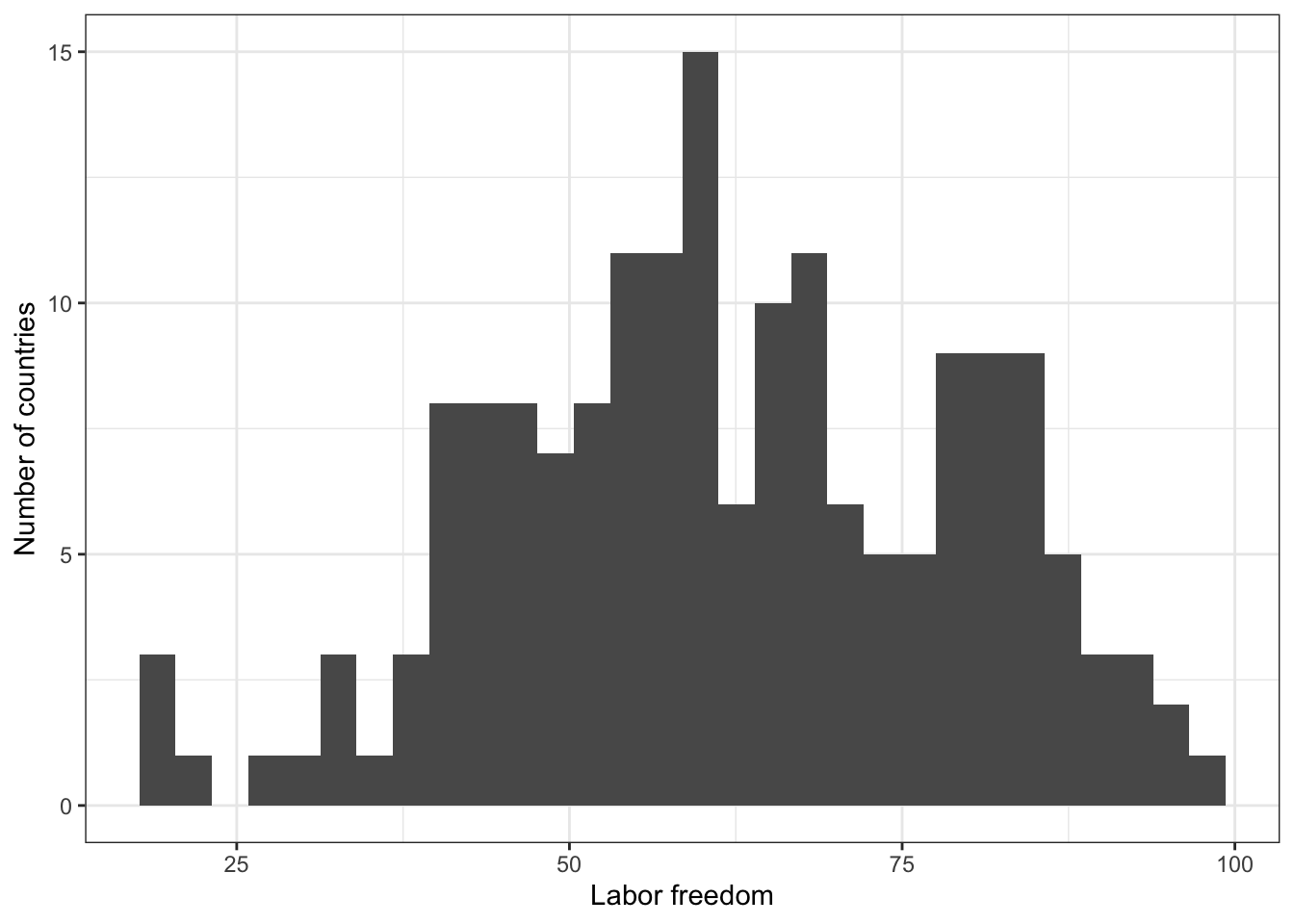
2.1 Describe Y: labor freedom
# Numerical summary
summary(world.data $ free_labor)
##    Min. 1st Qu.  Median    Mean 3rd Qu.    Max.    NA's
##   20.00   50.10   60.80   62.08   75.90   98.90      18
# Graphical summary
g <- ggplot( world.data, aes( x = free_labor ) ) + geom_histogram()
g <- g + ylab("Number of countries") + xlab("Labor freedom") + theme_bw()
g
## `stat_bin()` using `bins = 30`. Pick better value with `binwidth`.

## Warning: Removed 18 rows containing non-finite outside the scale range
## (`stat_bin()`).
# ggsave(file="hist-lab.pdf", width=8, height=5)
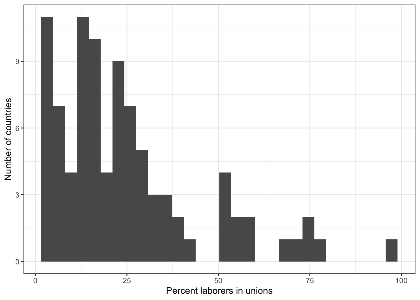
2.2 Describe X: union density
# Numerical summary
summary(world.data $ unions)
##    Min. 1st Qu.  Median    Mean 3rd Qu.    Max.    NA's
##    2.00   11.45   19.10   24.74   30.80   96.10     100
# Graphical summary
g <- ggplot( world.data, aes( x = unions ) ) + geom_histogram()
g <- g + ylab("Number of countries") + xlab("Percent laborers in unions")  + theme_bw()
g
## `stat_bin()` using `bins = 30`. Pick better value with `binwidth`.

## Warning: Removed 100 rows containing non-finite outside the scale range
## (`stat_bin()`).
# ggsave(file="hist-unions.pdf", width=8, height=5)
2.3 Describe X-Y
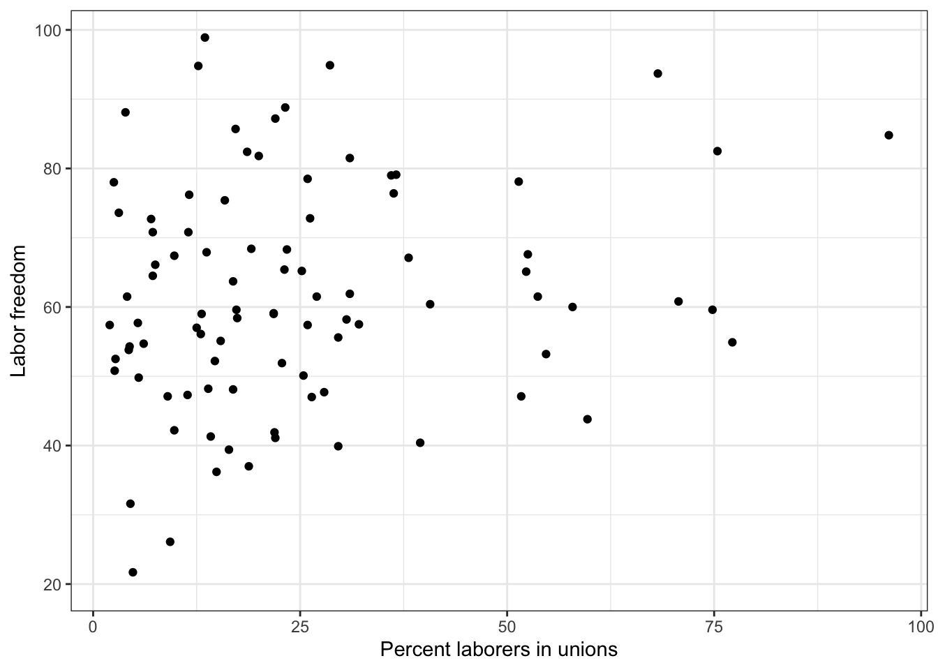
To describe an X-Y relationship graphically, we draw what’s called a scatterplot that shows the values of the X variable on the X-axis and the values of the Y variable on the Y-axis for all observations.
To create a scatterplot, we use the geom_point function (because each observation is denoted by a point.)
g <- ggplot(world.data, aes( x = unions, y = free_labor) ) + geom_point()  + theme_bw()
g <- g + ylab("Labor freedom") + xlab("Percent laborers in unions")
g
## Warning: Removed 100 rows containing missing values or values outside the scale range
## (`geom_point()`).
# ggsave(file="lab-unions.pdf", width=8, height=5)
Step 3 and 4. Calculate test-statistic & p
The test statistic for a bivariate test of two numerical variables is (Pearson’s) correlation coefficient. To calculate correlation coefficient (r), we first need to create a matrix object using the as.matrix function.
lab.uni.mat <- as.matrix(world.data[ c("unions","free_labor")])

# Then we use the rcorr function available in the Hmisc package.

rcorr(lab.uni.mat, type = "pearson")
##            unions free_labor
## unions       1.00       0.18
## free_labor   0.18       1.00
##
## n
##            unions free_labor
## unions         91         91
## free_labor     91        173
##
## P
##            unions free_labor
## unions            0.0913
## free_labor 0.0913
The first chunk of the output shows the calculated correlation coefficients for four combinations. Recall that we really need one of the four (the other three are redundant.) The reason there are four is that R calculates the correlation coefficients for the following four pairs
# Pair 1: unions -- unions
# Pair 2: unions -- free_labor
# Pair 3: free_labor -- unions
# Pair 4: free_labor -- free_labor
The correlation coefficient for Pairs 1 and 4 are both 1 (perfect positive correlation) by definition. The correlation coefficient for X-Y is exactly the same as the correlation coefficient for Y-X, so Pairs 2 and 3 are equivalent. So, we only need to look at Pair 2 OR Pair 3. We see that r = 0.18.
The second chunk of the output (n) shows the number of observations. There are 191 observations (191 countries) in the data set, but notice that the matrix says 91 in the left columns and the top-right cell. This means that there are only 91 observations where BOTH unions and free_labor are non-missing. For the remaining 100 observations, at least one variable is missing. The bottom-right cell says 173, because there are 173 observations (countries) for which free_labour is not missing.
The third chunk of the output (P) shows the p-values associated with r. We can see that p = 0.0913.
Sample write-up for interpreting of the result:
The estimated correlation coefficient between labor freedom score and unionization is positive (0.18) and statistically significant at 90% confidence level but not at 95% confidence level, supporting our expectation that more labors in unions increases labor freedom in a country. But we only have a moderate level of confidence on our result.
3. Adding lines and labels to a graph
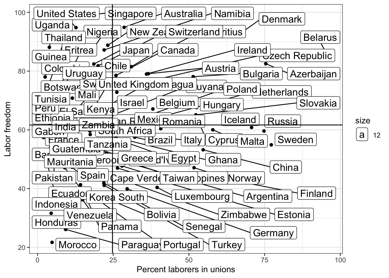
We might want to add a horizontal line drawn at mean(Y) and a vertical line drawn at mean(X) to facilitate interpretation of the X-Y relationship. Let’s see how we do this.
Recall that the unions variable has as many as 100 missing values.
summary(world.data $ unions)
##    Min. 1st Qu.  Median    Mean 3rd Qu.    Max.    NA's
##    2.00   11.45   19.10   24.74   30.80   96.10     100
This means that the mean of Y (free_labor) calculated for the whole sample will probably be different from the mean of Y calculated for the sample where unions is not missing. To simplify our jobs, let’s first create a new data set that excludes those observations where at least one of the two variables is missing.
lab.data <- world.data[is.na(world.data $ unions) == FALSE & is.na(world.data $ free_labor) == FALSE, ]

# Then we calculate the mean values:

mean.y <- mean(lab.data $ free_labor)
mean.x <- mean(lab.data $ unions)

mean.y
## [1] 61.65714
mean.x
## [1] 24.73846
We use the geom_hline to draw a horizontal line and the geom_vline to draw a vertical line
g <- ggplot( lab.data, aes( x = unions, y = free_labor) ) + geom_point( )  + theme_bw()
g <- g + ylab("Labor freedom") + xlab("Percent laborers in unions")
g <- g + geom_hline( aes( yintercept = mean.y))
g <- g + geom_vline( aes( xintercept = mean.x))
g
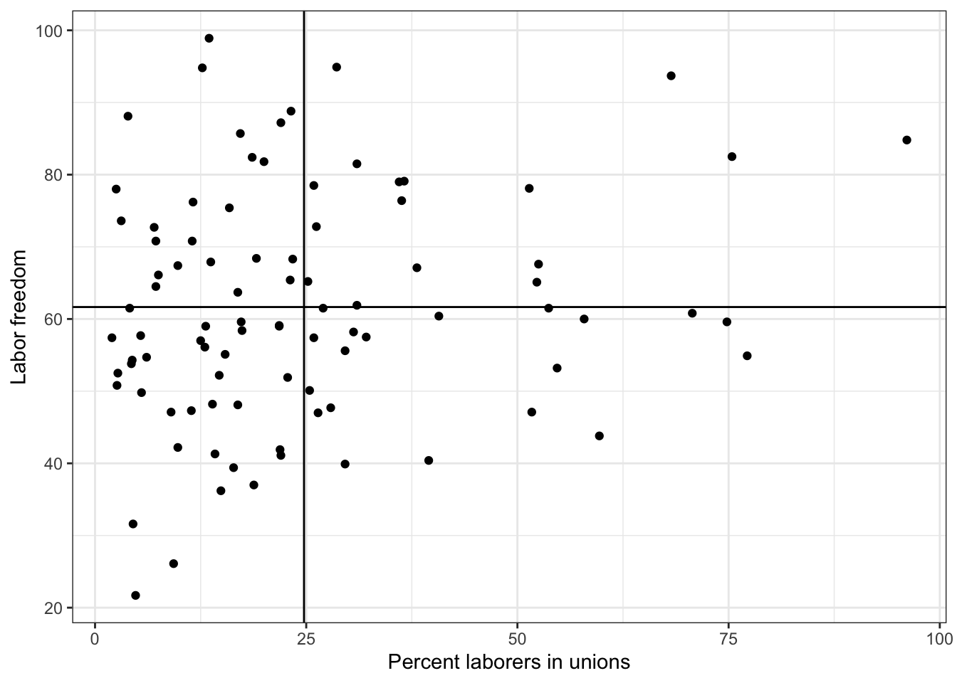
We may also want to add labels to each point so that we can know which country observation is plotted. We use the geom_text function
g <- ggplot(lab.data, aes( x = unions, y = free_labor) ) + geom_point()  + theme_bw()
g <- g + geom_text(aes(label = country))
g <- g + ylab("Labor freedom") + xlab("Percent laborers in unions")
g <- g + geom_hline( aes( yintercept = mean.y))
g <- g + geom_vline( aes( xintercept = mean.x))
g
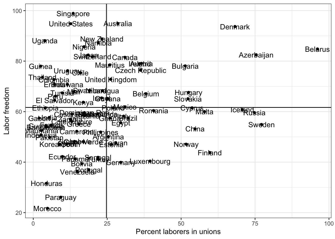
Ugly right? What do we do if we want to avoid labels overlapping on points?
library(ggrepel)

g <- ggplot(lab.data, aes( x = unions, y = free_labor) ) + geom_point()  + theme_bw()
g <- g + geom_label_repel(aes(label = country, size =12))
g <- g + ylab("Labor freedom") + xlab("Percent laborers in unions")
g <- g + geom_hline( aes( yintercept = mean.y))
g <- g + geom_vline( aes( xintercept = mean.x))
g
## Warning: ggrepel: 58 unlabeled data points (too many overlaps). Consider
## increasing max.overlaps
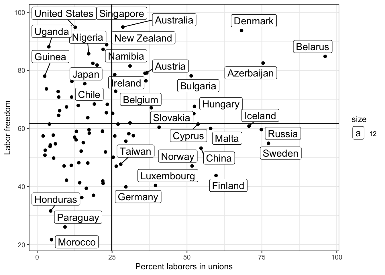 Now it’s easier for us to see outliers.
Some labels are not shown. We can follow the instructoin by increasing max.overlaps
library(ggrepel)
options(ggrepel.max.overlaps = Inf) # show all labels

g <- ggplot(lab.data, aes( x = unions, y = free_labor) ) + geom_point()  + theme_bw()
# g <- g + geom_text(aes(label = country))
# g <- g + geom_text_repel(aes(label = country))
g <- g + geom_label_repel(aes(label = country, size =12))
g <- g + ylab("Labor freedom") + xlab("Percent laborers in unions")
g <- g + geom_hline( aes( yintercept = mean.y))
g <- g + geom_vline( aes( xintercept = mean.x))

# g  = g + theme( plot.title=element_text(size=16,face="bold"),
#        axis.text=element_text(size=18),
#        axis.title=element_text(size=20,face="bold"))
# g = g + geom_text(aes(size = 12))
g
